With very few adjustments to the design, you can make a huge difference to the look of shipping boxes. Here's a great example of this, with these shipping boxes from an elegant bedding brand.
We all know the classic brown cardboard boxes with logo that the vast majority of online shops use for shipping. They're an easy and practical solution that gets the job done. But do they give customers a sense of who you are as a brand? Or do they show something about the value or quality of the product? They don't, do they?
A crisp signature colour or a groovy graphic can do wonders for an otherwise brown cardboard box.
A crisp signature colour or a groovy graphic can do wonders for an otherwise brown cardboard box.
If you have brand colours - use them!
If you have brand colours - use them!
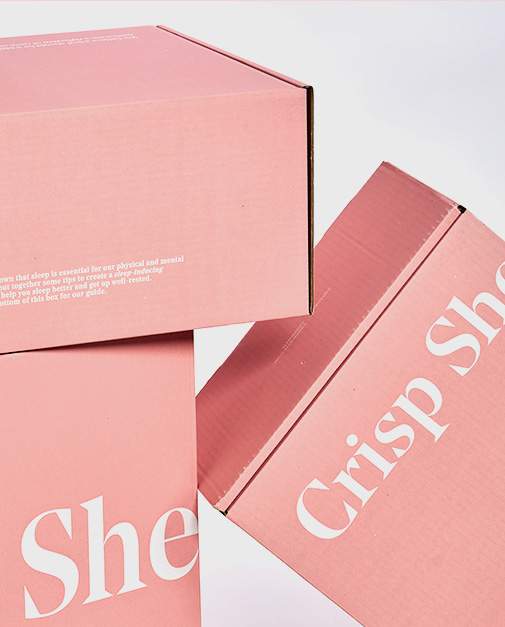
Here, ordinary brown shipping boxes have been made both exciting AND exclusive by using the brand colours and by utilising every surface to convey what the company stands for.
All surfaces are in a deep salmon colour. The boxes exude softness, calm and intensity. The colour matches the brand's identity and is used in everything from the website design to the products.
The classic cardboard box structure is still clearly visible under the colour, but it only emphasises the naturalness and sustainability initiatives that are also part of the company's DNA.
The colour is instantly eye-catching and recognisable to the recipient - and requires nothing more than a simple signature colour.
Make your customers curious with graphics
Make your customers curious with graphics
However, the signature colour doesn't stand alone. The logo and other graphics are placed unconventionally on the boxes. The logo is broken down over the corners and sides of the boxes as an unusual but well-thought-out graphic element. This means that the boxes with the logo are suddenly transformed into designer packaging that enhances the recipient's impression of quality. A quality that also applies to the impression of the product inside.
The clear logo is joined by small statements and information that emphasise the brand's values and highlight what the product can do. For example, the company wishes the customer "SWEET DREAMS" and gives tips for a night of better sleep. They play with different fonts but keep all the writing in white.
This way, the reading is both playful, but also clear. They show that the customer is the focus even before they have the product in hand and that the company has professional expertise that they share generously to give the customer a fantastic experience of incredible service, standard and commitment.
It's a well-crafted and superbly designed example of how colour and text can transform packaging from standard to exclusive.
It also brings the brand and products to life and sends a clear signal to the customer about the organisation's identity, values and level of service.
Beautiful funky cardboard boxes with excitement, joy and brand information
Beautiful funky cardboard boxes with excitement, joy and brand information
That's what these shipping boxes are. They prove that a good design, a quirky print or a well-thought-out graphic can take packaging a million miles above the standard brown cardboard box. A simple solution that makes it easy for customers to recognise your brand and remember you the next time they're looking for something like bedding.
Think about how your packaging can showcase your values in its simplicity - whether they are based on quality, sustainability or exclusivity. A few changes to your packaging design can make a big difference.
It may be "just" a box with a logo. But let it be a colourful, stylish, interesting or tasteful box with a logo. Then there's no doubt you'll be remembered for longer.
Let's talk
We are happy to hear from you if you have any questions or need a quote. Fill in this form and one of us will contact you as soon as possible.
Other stories
Creative lab
Design is key
Let us invite you into a world of bold colours and patterns, magnificent materials, innovative designs and sustainable solutions.
Design project
Storytelling through packaging design
Luxury bags dark blue as the night with an embossed silver logo is what you get when you shop for oils and lotions designed for a night of better sleep. The company ByNacht has created packaging that shows its customers the essence of its products.
Design Project
Wine bags for every mood
Giving the host a bottle of wine? We have designed one gift bag that comes in an abundance of different designs. What's your mood? You choose.


